04. Book Cover Design - 1
BOOK COVER DESIGN
1. INITIAL IDEA & RESEARCH
I chose the book is titled Glass for re-design. Because, I am going to study glass art and I would like to design something related to my pathway. However, even though this book includes many kinds of useful information about that, the design of book’s cover seems quite out of date. Due to the fact that of that reason, it does not seem fascinate the public. Thus I decided re-design this cover of the book.
Before I started to designing, I had made certain the size of book cover. The actual size was ten centimetre in width, nineteen point four centimetre in hight, and the spine of the book was one point nine centimetre in width. Moreover, the flap was three point seven in width.
[Research]
2wins (2015) 잡지 표지디자인 자료 모음 #1 [Weblog] 디자인하는 쌍둥이의 청춘 블로그. 23rd July. Available from: http://blog.naver.com/PostView.nhn?blogId=h_e_2wins&logNo=220429037161&beginTime=0&jumpingVid=&from=search&redirect=Log&widgetTypeCall=true&topReferer=http://search.naver.com/search.naver%3Fwhere%3Dnexearch%26query%3D%25EC%259E%25A1%25EC%25A7%2580%2B%25EB%2594%2594%25EC%259E%2590%25EC%259D%25B8%26sm%3Dtop_hty%26fbm%3D0%26ie%3Dutf8%26url%3Dhttp%253A%252F%252Fh_e_2wins.blog.me%252F220429037161%26ucs%3Dkrc2nnpyVb6T [Accessed 16/04/17].
This cover design tends to be simple and clear. Each of the book covers was used a high definition photo, colours which are comfortable to human eyes, and some of neat fonts for the refined design. Even though, it is slightly hard to know their genres of the books by looking the book covers, but in my opinion, both covers are enough to capture consumers’ hearts.
JANET HANSEN ( ? ) The Novel Cure. [Weblog] JANET HANSEN. ? / ?. Available from: http://www.janet-hansen.com/#/novel-cure/ [Accessed 17/04/17].
This book cover is used pattern design for cover designing. The book has the impact of the blue colour and repeated patterns. It seems to make the best effect by using the minimal colours.
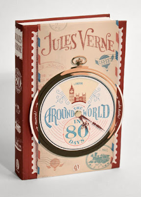
JIM TIERNEY ( ? ) Jules Verne Series. [Weblog] faceout Book. ? / ?. Available from: http://www.faceoutbooks.com/267967/Jules-Verne-Series [Accessed 17/04/17].
This book cover looks like an elaborate work. It seems to be used a drawing and calligraphy for the definition of the book's title, and it looks quite appropriate with its. In addition, it can be felt warm, comfortable and sensibility.
HILARY WALKER (2016) THE CRAFT COMPANION. [Weblog] HILARY WALKER. 13th April. Available from: http://www.hilarywalker.com.au/blog/ [Accessed 17/04/17].
As it can be seen from the title ot the book, the contents of that is related to a craft, and the cover design shows a number of kinds of crafting materials by a neat digital drawing. Furthermore, it tends to give an effect by using a gold plating for emphasis on the title.
I took this picture in London. When I was walking near Hackeny, I found a book shop, and they sold books wich related to art and design.Thus, I took the picture simply for my project research.
[Initial Idea sketch]
This is my one of the initial designs. I would like to show the book cover is composed of light and shadow from the glass. Because, light and shadow through the glass are beneficial points for representing glass's special feature.
This is my second idea sketch, and I chose this design for my final piece.
The book includes definitions of glass artworks, thus I decided to put silhouettes of glass artworks on the book cover.
Therefore, the final idea sketch was completed like that. I am going to use turkish blue or emerald green colour for silhouettes, and beige is going to be used for the background colour.
The reason why I chose that colour is, because the clear and cool tone colours that comes to mind firstly when I think of glass, and the beige colour is good for protecting of eye fatigue. Thus, I thought that was appropriate for a colour of the book.
... to be continued next post


Comments
Post a Comment